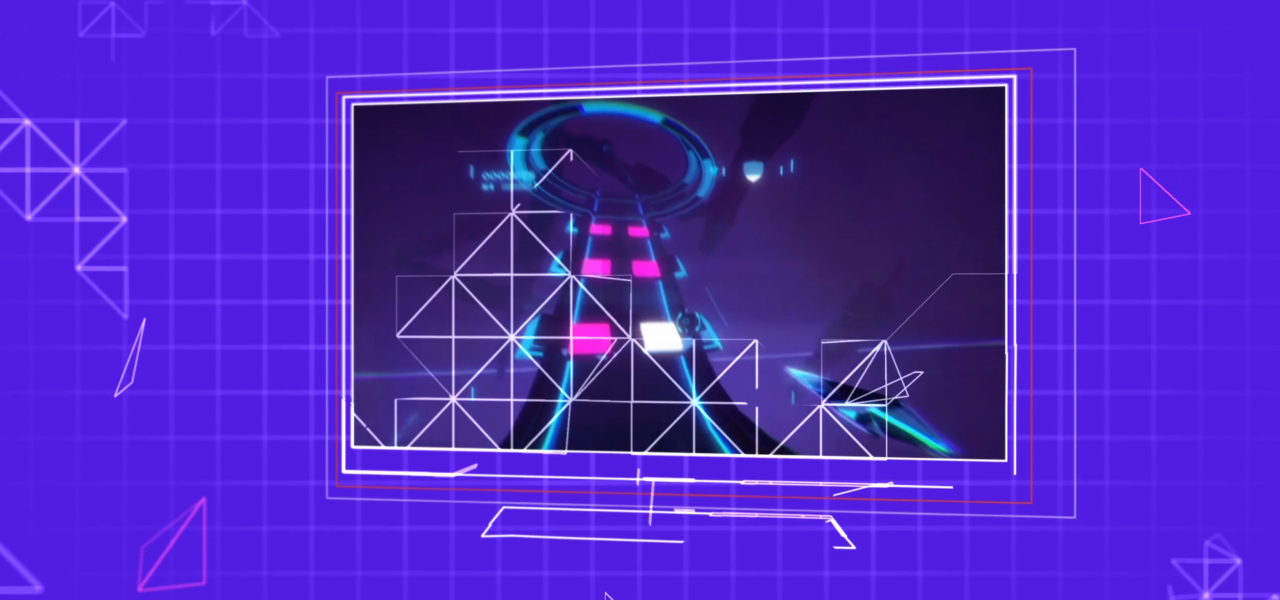
Kartridge Launch Campaign
A motion identity that grew with a gaming platform from teaser to launch
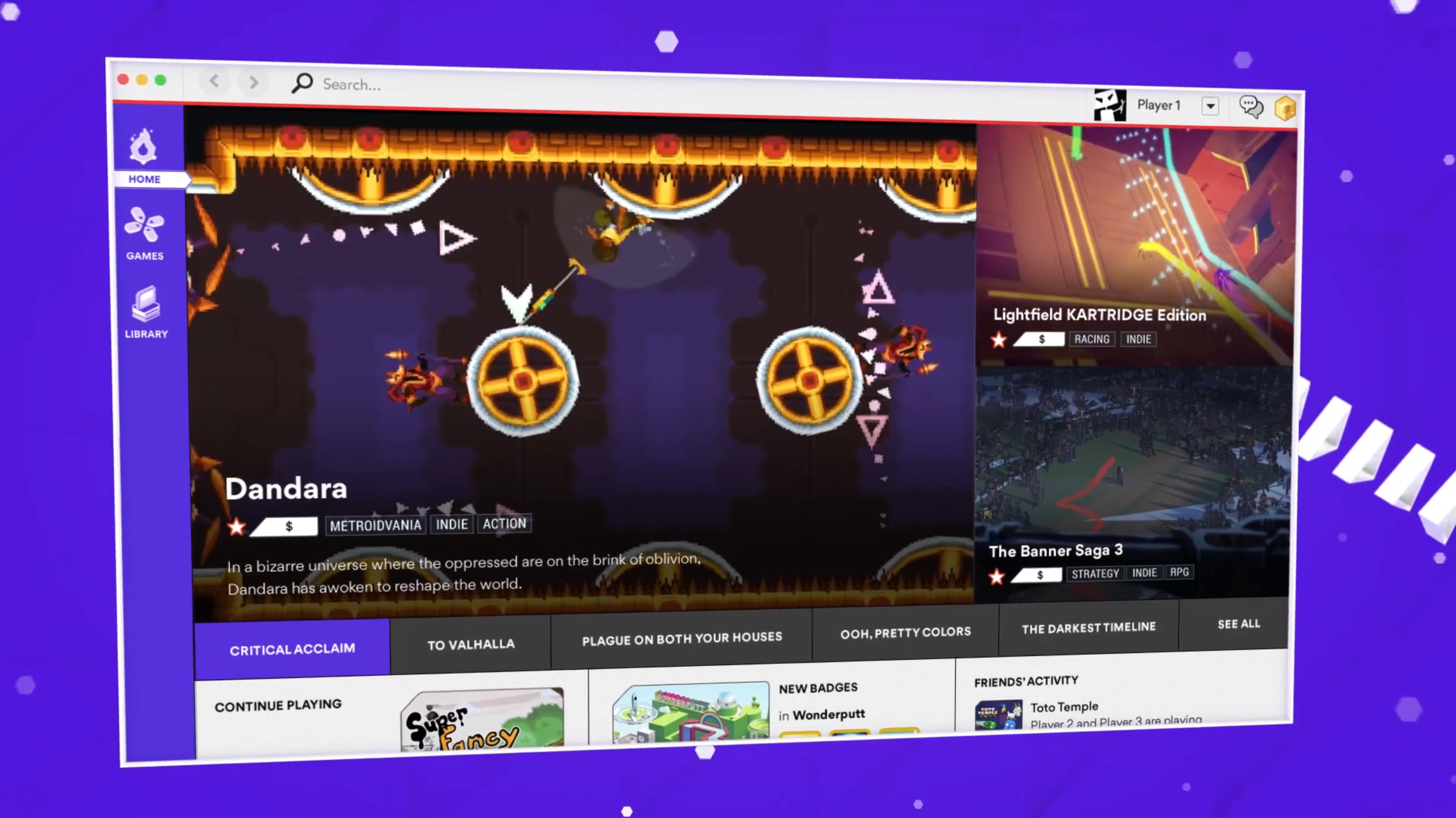
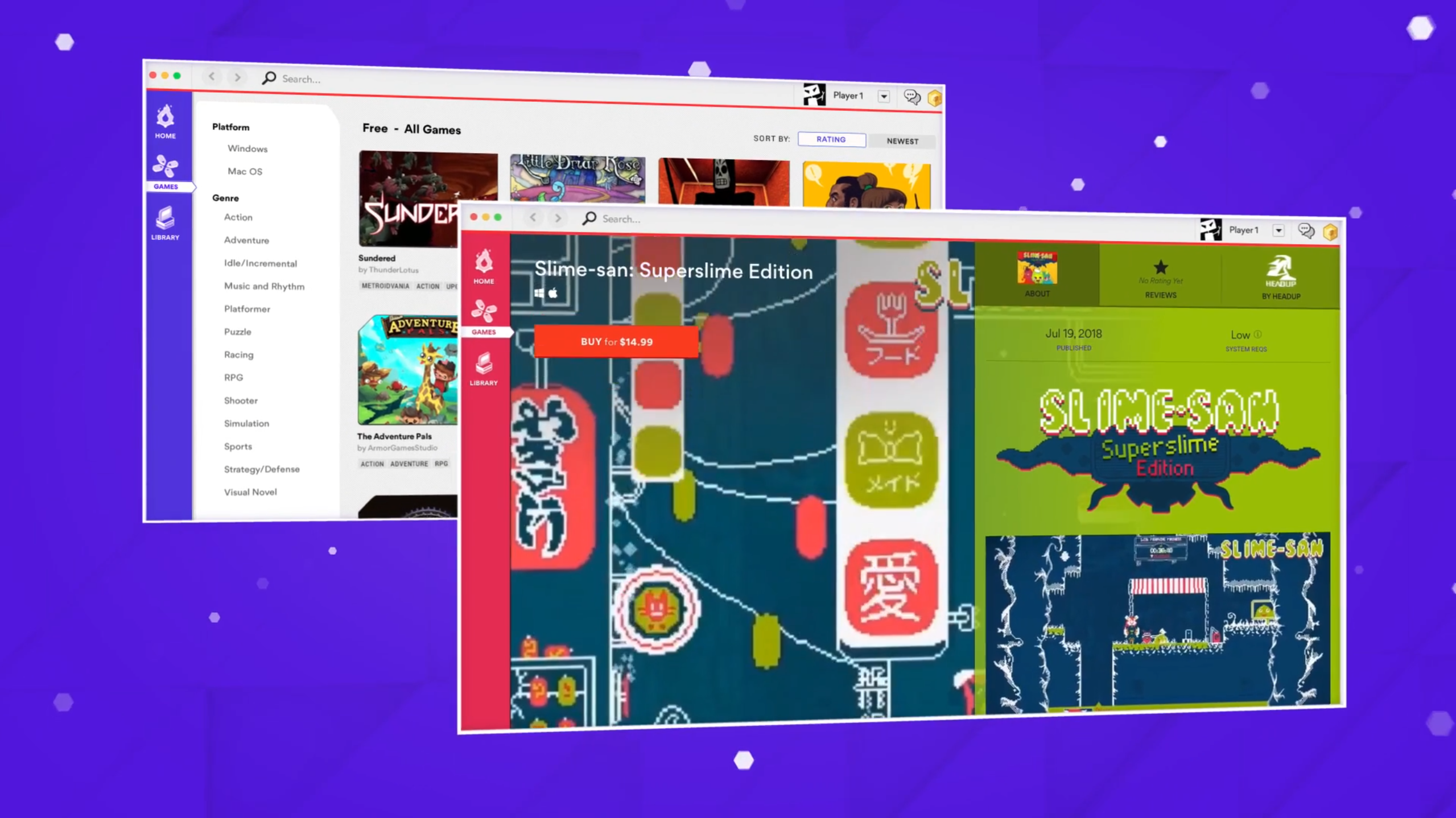
Motion identity and launch work for Kartridge, a digital platform focused on indie games. I helped build the visual language across teaser and launch content, combining platform UI, game footage, motion graphics and branding into a system that could introduce the product before launch and then evolve once the platform was live.
Brief
Kartridge needed campaign content that could introduce a new gaming platform while establishing enough visual identity to feel recognisable beyond any individual game featured on it.
The work covered pre-launch promotional material, logo animation, UI-led motion graphics and later post-launch videos. The second phase needed to feel like an evolution of the first rather than a completely unrelated campaign.
Challenge
The platform's content was constantly changing because every featured game brought its own visual style.
The motion language therefore had to provide structure without competing with the games themselves. It needed enough personality to identify Kartridge, but enough neutrality to hold everything from colourful indie titles to darker, more cinematic content.
As the campaign moved from teaser to live product communication, the style also had to mature without losing continuity.
Execution
I developed motion around layered platform windows, geometric framing, UI-inspired transitions and a modular graphic structure that could accommodate different games without redesigning the system each time.
The pre-launch material leaned more heavily into anticipation and abstract platform language. After launch, the same structural ingredients were refined to show more of the real product, library and ecosystem.
Logo animation, teaser content, launch trailers and supporting motion assets all shared recognisable behaviours, so the campaign could evolve while still feeling like the same brand.
Stills & Styleframes
Results
The project established a coherent motion language across both the pre-launch and post-launch phases.
Because the structure was modular rather than tied to one game, the campaign could keep changing content while retaining a recognisable Kartridge identity. It also gave me an early example of designing motion for a platform ecosystem rather than one isolated promo.
Personal View
The interesting part was not simply making two trailers. It was deciding what should stay consistent when almost everything inside the frame could change.
That is still a useful branding question today: if you remove the logo, what behaviour makes the piece feel like it belongs to the same world?