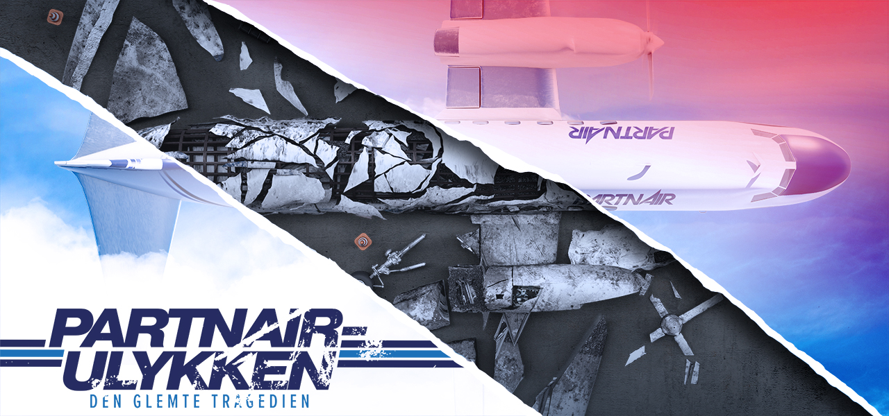
Partnair – The Forgotten Tragedy
A travel image that tears open into the investigation underneath
Official key art for Viaplay's documentary about the Partnair Flight 394 disaster. I developed the concept around a simple visual contradiction: the optimistic language of a travel brochure physically tearing open to reveal the reconstructed wreckage beneath, allowing one image to hold both the promise of an ordinary journey and the forensic reality that followed.
Brief
Viaplay needed key art for a documentary about a lesser-known aviation disaster. The image had to communicate tragedy and investigation without becoming sensational or relying on familiar disaster-documentary clichés.
It also needed to work as a premium campaign asset across streaming covers, posters and promotional materials, where the core idea had to read quickly even at small sizes.
The Challenge
Planes, smoke and wreckage are obvious visual shorthand for aviation disasters, which is exactly why they can become generic.
The challenge was to find a metaphor that carried the emotional shift in the story: people beginning what should have been a routine journey, followed by a painstaking investigation into what went wrong. The subject also required restraint and respect.
Execution
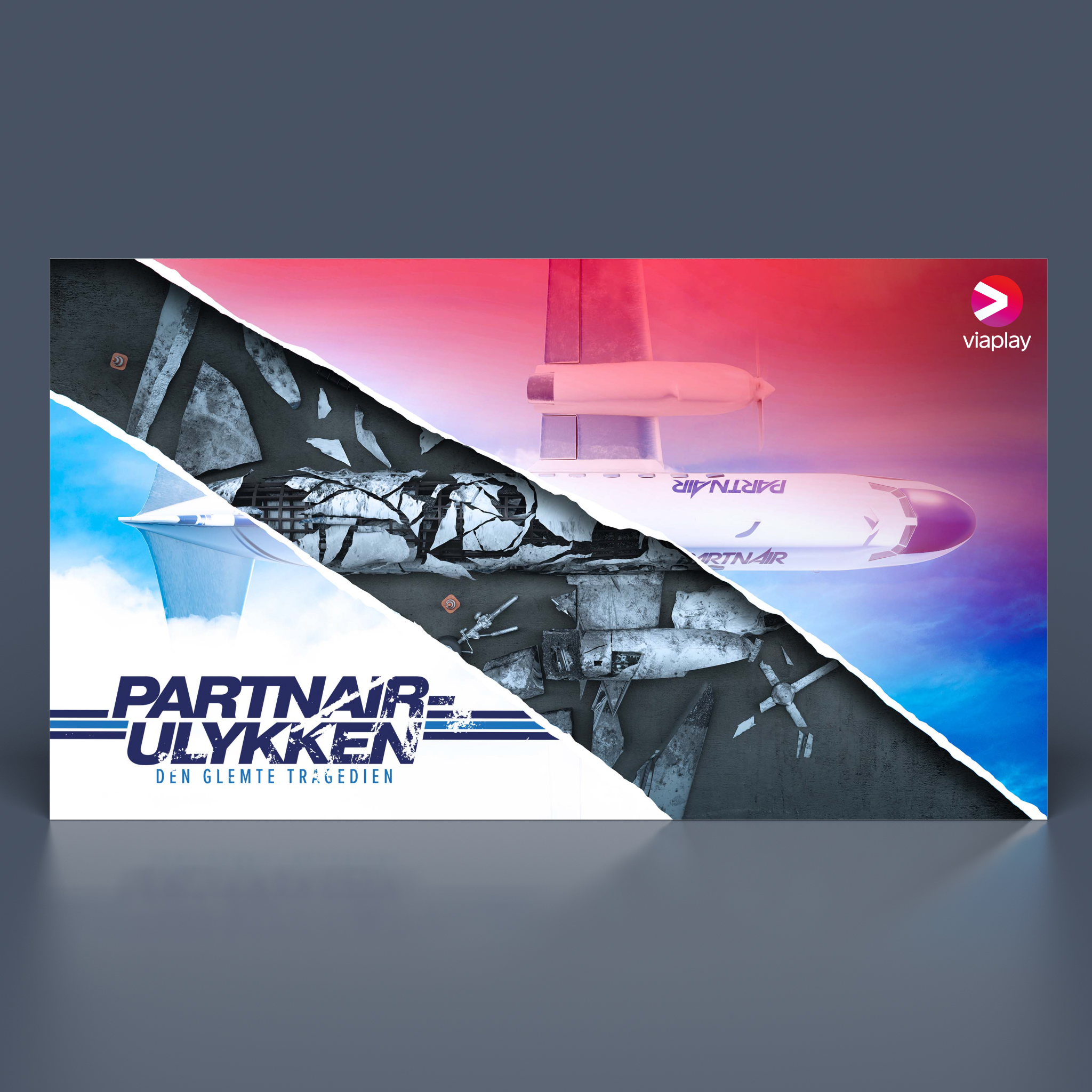
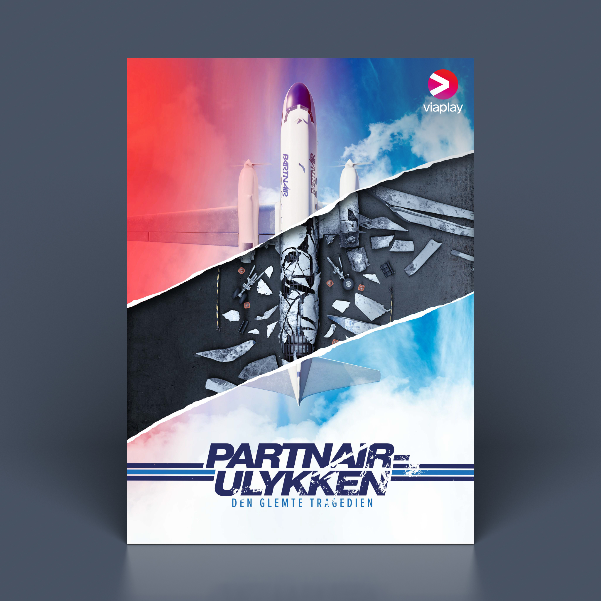
I developed the composition as a clean travel-catalogue image of the Partnair aircraft above bright clouds. A torn-paper transition then breaks through that optimistic surface to reveal the darker forensic world below.
I modelled and arranged the debris in 3D using crash-investigation layouts as visual reference, then combined that with compositing, typography and a split colour treatment: warm, inviting travel imagery above and colder investigative tones beneath.
The tear became both the graphic device and the storytelling device, connecting the two realities in one frame.
Stills & Styleframes
Results
The artwork became the documentary's official key visual across Viaplay's streaming and campaign materials.
The concept gave the film a recognisable image that communicated both narrative and tone without showing graphic content, setting up the documentary before the viewer had read a synopsis.
Personal Reflection
This was one of those projects where the visual metaphor did most of the heavy lifting.
Once the travel brochure tearing into the investigation appeared, the rest of the design became about supporting that idea rather than trying to make the tragedy look more dramatic. That felt like the right approach for the subject.