
See Denmark
A playful channel identity with just enough weirdness
A full channel identity and motion system for See Denmark, built to feel young, confident and entertaining without trying too hard. I developed the concept, visual language and motion world around bold typography, surreal 3D imagery and a dry sense of humour, then made sure it could behave consistently everywhere from on-air graphics to outdoor and digital formats.
Brief
See Denmark wanted more than a cosmetic refresh. The channel needed a clearer personality and a visual identity that could make it a natural choice for relaxed entertainment, whether that meant football, a Simpsons rerun or a late-night movie.
The brief was deliberately open: create something bold, inviting and recognisable that felt part of the wider Viaplay family, but still unmistakably See. I had a lot of creative freedom, which is always excellent right up until the blank page starts staring back.


The Challenge
The existing audience skewed male, while the new identity needed to open the channel up to a broader audience without pushing existing viewers away. The tone had to sit in a fairly narrow sweet spot: youthful but not childish, funny but not goofy, polished but not overly serious.
It also had to work as a real broadcast system, not just a nice moodboard. The same idea needed to survive tiny corner bugs, promos, idents, social assets and large-format outdoor applications without losing its personality.
Execution
I started with tone rather than decoration. I wanted the channel to feel like a clever friend who genuinely enjoys entertainment and occasionally says something slightly odd.
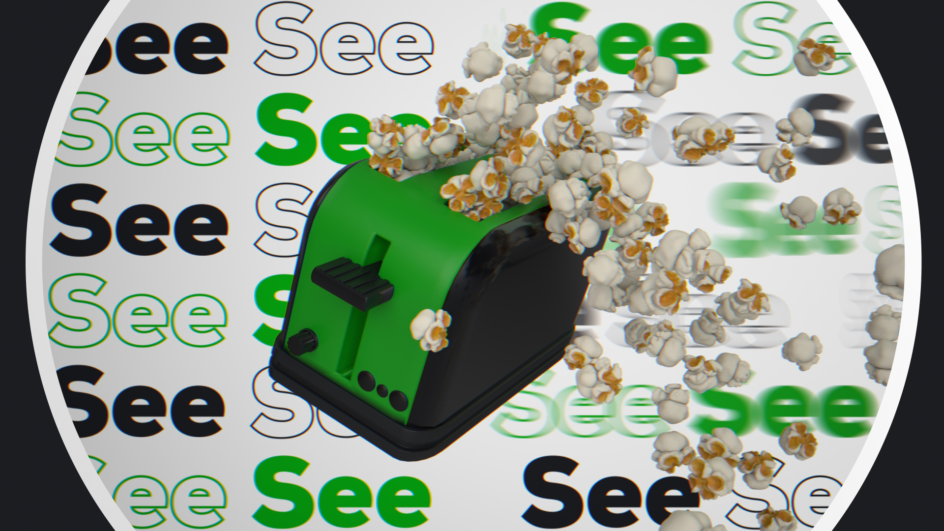
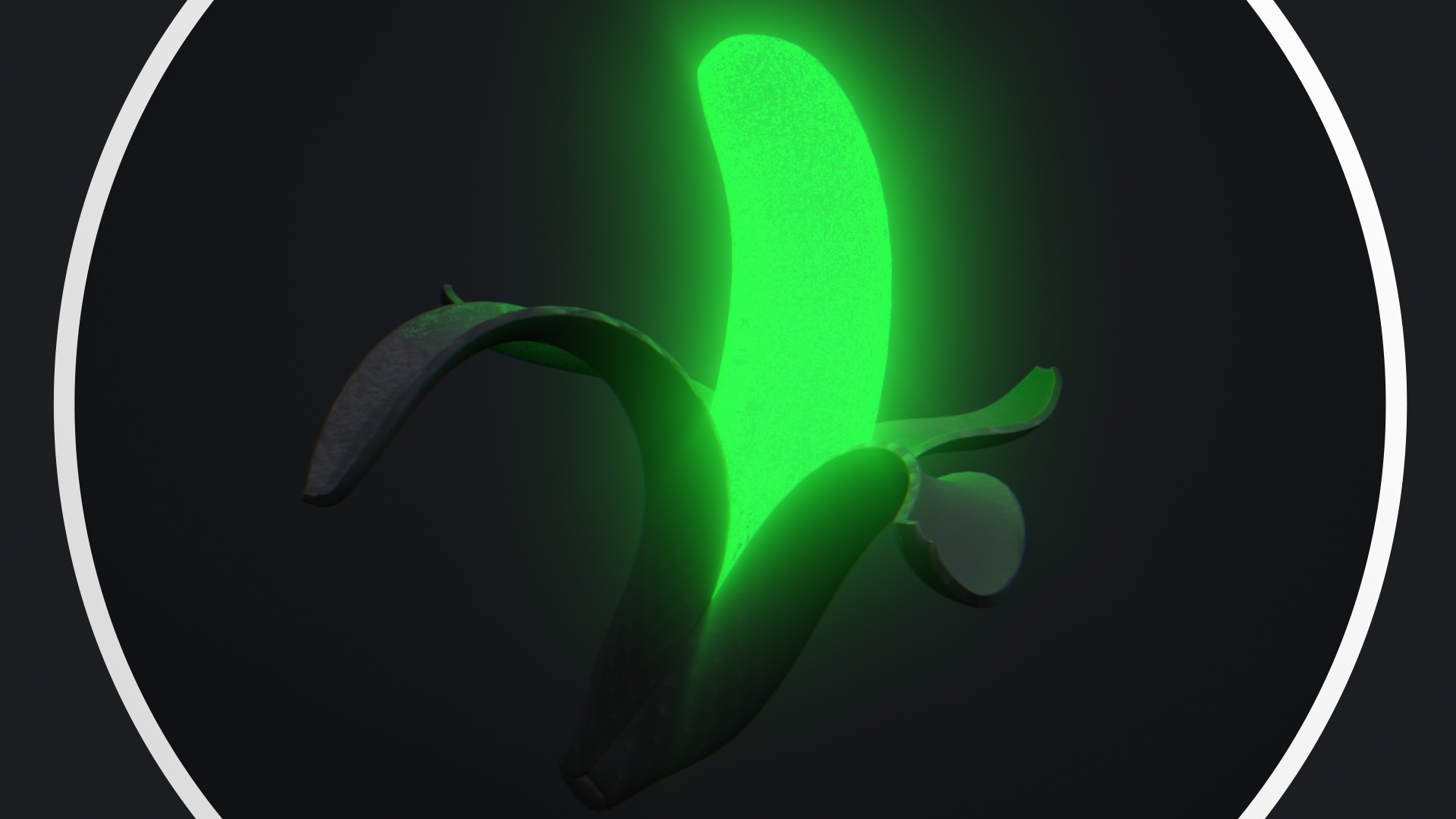
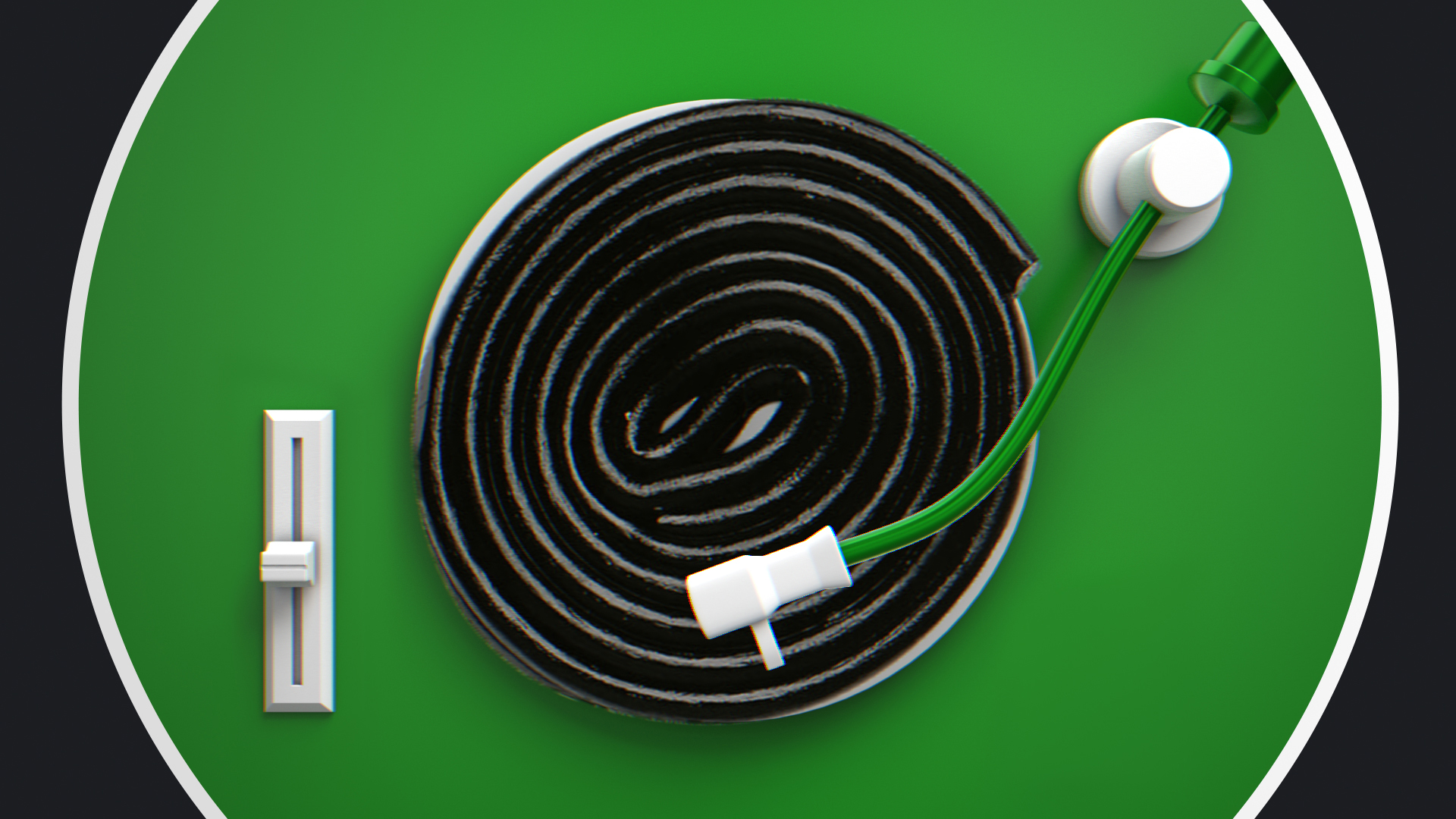
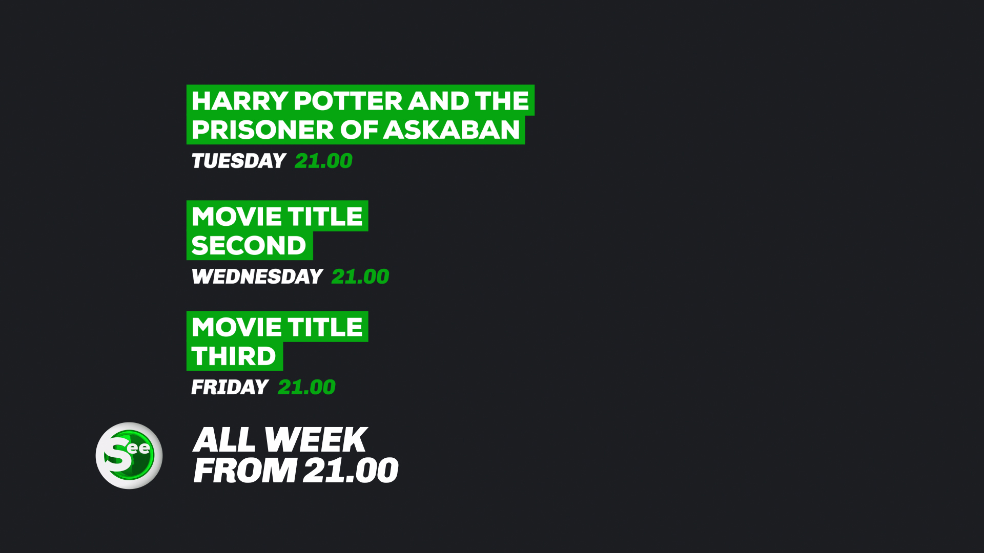
That led to a visual world of unexpected object combinations, surreal 3D moments and bold typography. Ideas included popcorn appearing from places it probably should not, and a black cat with logo-shaped eyes. I designed the logo within the Viaplay brand family, then developed idents, on-air graphics and supporting assets in Maya and After Effects.
The system was intentionally simple underneath the humour: clear hierarchy, recognisable shapes and repeatable motion principles, with the stranger ideas layered on top.

Stills & Styleframes

Results
The final identity gave See a clearer, more distinctive personality while staying flexible enough for everyday broadcast use. It was rolled out across on-air, digital and social applications, with the same visual language holding together across very different formats.
Most importantly, the channel felt more like entertainment itself: polished, approachable and slightly unpredictable.
Personal Reflection
This was one of those projects where being a little strange was genuinely useful. I enjoyed finding the line between a disciplined brand system and ideas that felt playful enough to surprise people.
If I had another round with it, I would probably push the world further with seasonal idents and recurring characters. The black cat deserved a career of its own.