
ESL Rebrand
Helping esports look like the major sport it had already become
A rebrand for ESL built around a strategic shift: present competitive gaming with the confidence, emotion and visual authority of a major sports league without sanding away its digital roots. I contributed to concept development and motion design, helping build a modular identity that could move from broadcast graphics to arena screens, social content and physical event branding.
Brief
ESL wanted to move beyond the perception of esports as niche gaming content and present itself as a serious global sports property.
The identity needed the scale and confidence associated with football or basketball broadcasts, but it could not simply borrow traditional sports aesthetics. It had to feel native to gaming culture and credible to a rapidly growing mainstream audience at the same time.

The Challenge
The central tension was obvious: too much traditional sport and ESL could look generic; too much futuristic gaming language and it would reinforce exactly the niche perception the rebrand was trying to move beyond.
The system also had to work in wildly different environments, from lower thirds and live overlays to huge arena screens, merchandise, digital campaigns and physical signage.
Execution
The wider team developed the identity around 'moments of greatness', treating ESL as the stage where elite competitive moments happen rather than simply an organiser of tournaments.
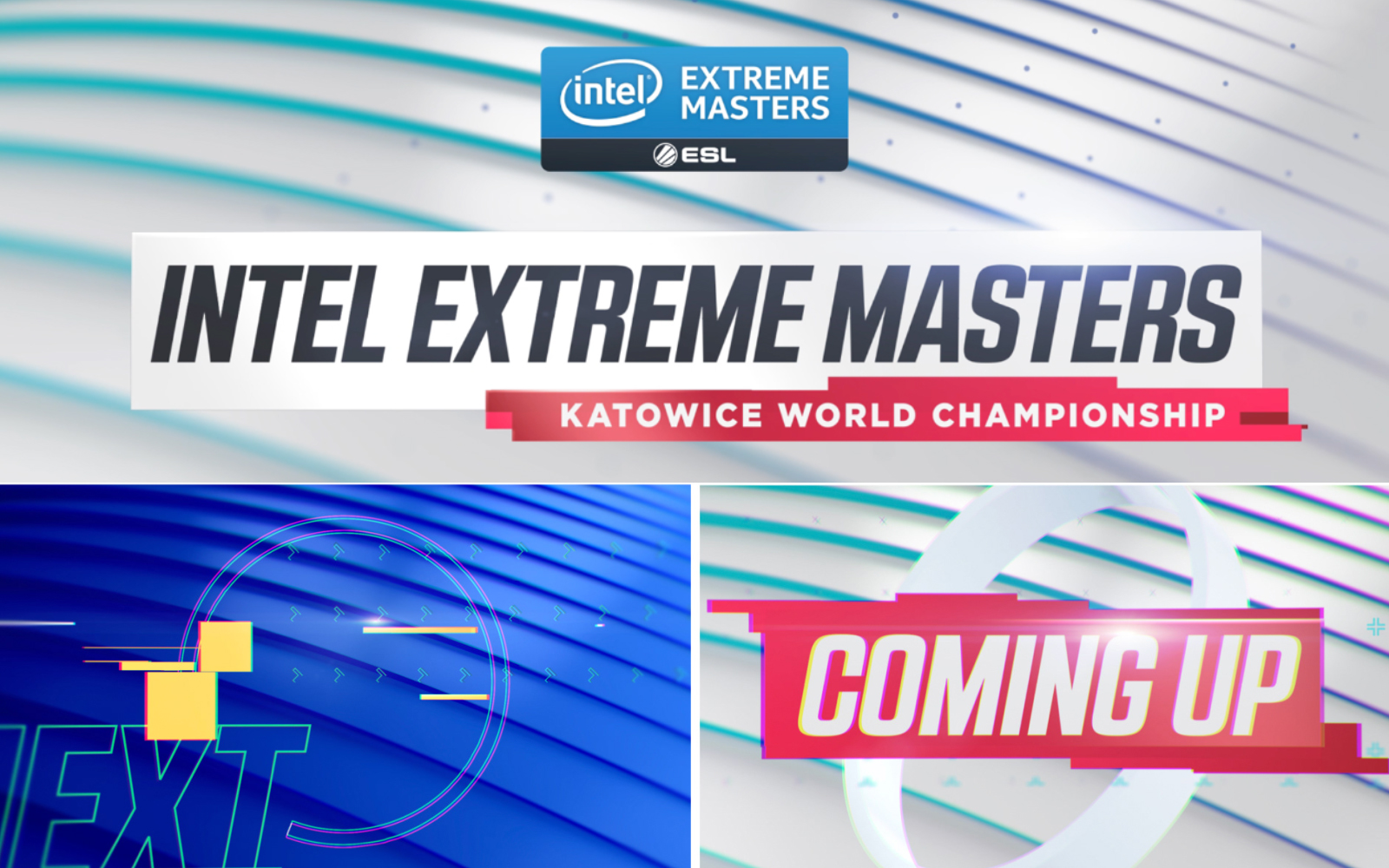
I worked on the motion concept and animated toolkit, combining sports-broadcast confidence with digital behaviours such as data movement, pixel-based transitions and strong player-focused framing. The graphics were modular so the same design language could scale between live production, arena content, social outputs and off-air campaign material.
The aim was never to make gaming look like football. It was to give esports the same level of visual seriousness while keeping its own culture intact.
Watch the ESL Graphics Toolkit video here:
ESL Graphics Toolkit.
ESL Live Event Assets:
ESL Live Event Assets.
ESL Off-Air Look:
ESL Off-Air Look.
ESL Ident:
ESL Ident.
Stills & Styleframes
Outcome
The identity gave ESL a more mature and unified presence across live events, broadcast and campaign touchpoints while retaining the energy of esports.
Seeing the system operating at arena scale, surrounded by real crowds and competition, was the strongest proof that the visual language could hold its own far beyond a desktop screen.
Personal Reflection
Gaming had been part of my life long before esports filled arenas, so this project felt unusually personal.
What interested me most was not making something 'look gamer'. It was helping communicate that the competition, emotion and spectacle were already real sport. The branding simply needed to catch up.