
TV6 Sweden Channel Rebrand
Turning a famous voice into a visual personality
A full TV6 Sweden rebrand built around one of the channel's strongest existing assets: its unmistakable continuity voice. Rather than inventing a personality from scratch, we translated the humour, confidence and timing audiences already knew into typography, motion and on-air behaviour.
Brief
TV6 needed a new visual identity without losing the attitude that made the channel recognisable. Its continuity voiceover artist had become part of the brand in his own right, joking with viewers, teasing shows and occasionally roasting the content he was supposed to promote.
The opportunity was obvious: instead of keeping that personality only in the audio, build a visual system that could behave the same way.


The Challenge
Voice and humour are difficult things to turn into graphics without ending up with a gimmick. The identity still had to work as a clear, professional broadcast system across promos, navigation and everyday channel communication.
The trick was to let humour influence the timing, typography and structure rather than simply adding jokes on top of a conventional package.
Execution
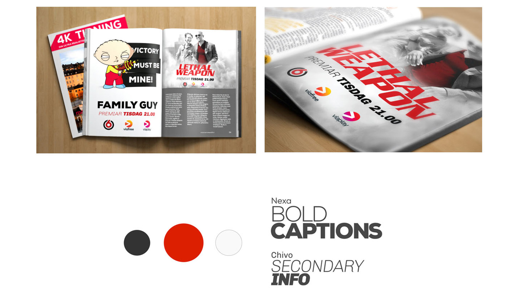
We developed a bold red, black and white visual language with strong typography, cinematic framing and plenty of room for captions, quotes and short punchlines. I worked on the design and motion behaviour, using the voiceover's delivery as a reference for pacing.
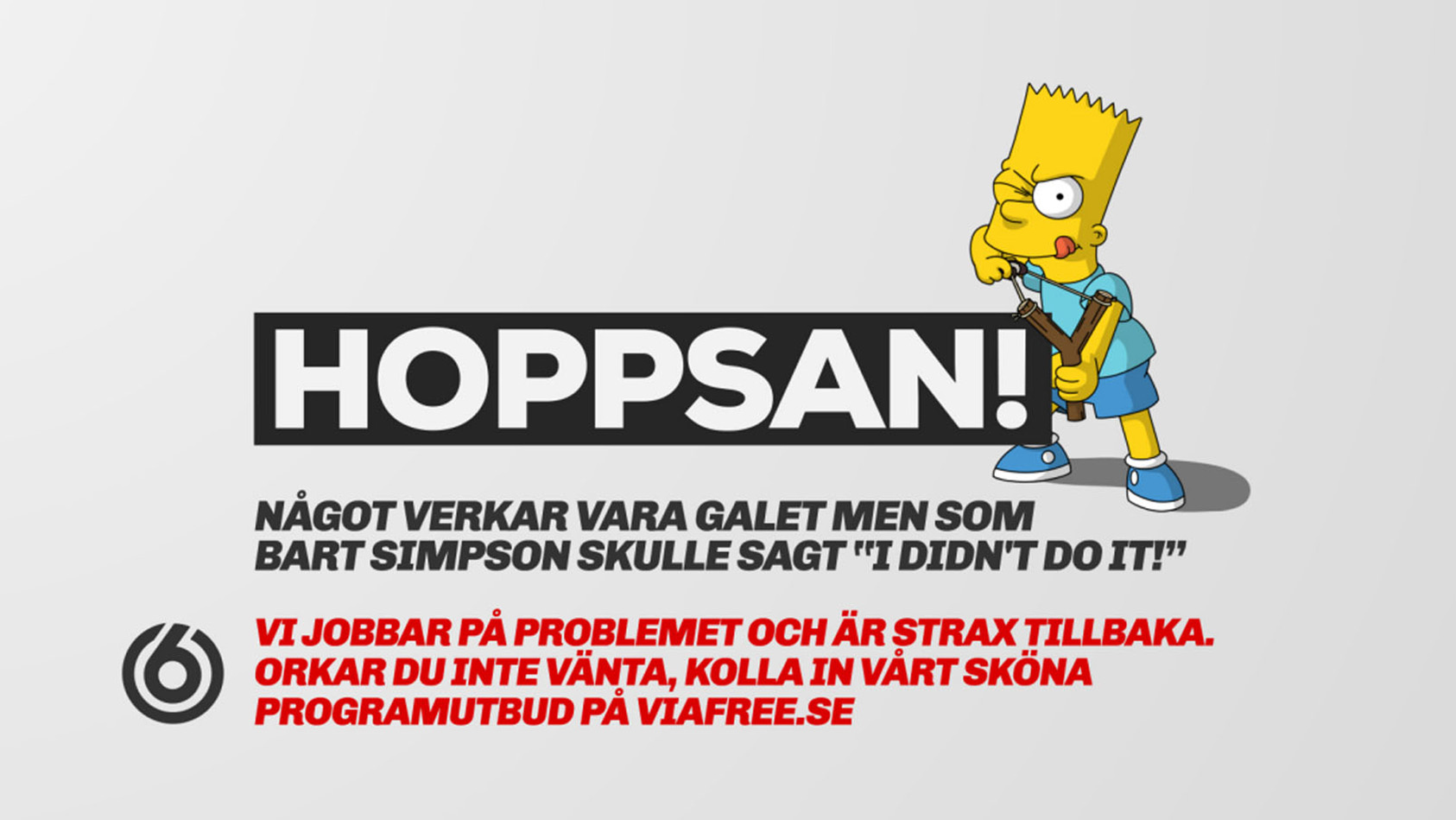
Transitions were direct and confident rather than elegant for the sake of elegance. Text could interrupt, react or land like a punchline. Spoken lines became part of the composition, so graphics and voice felt like two parts of the same character.
The result was a brand system with a point of view rather than just a set of assets.

Stills & Styleframes
Results
The rebrand gave TV6 a stronger and more recognisable visual voice while preserving the personality audiences already associated with the channel. The identity felt familiar without feeling old, because it amplified something genuine rather than inventing a new attitude from nowhere.
It also created a flexible on-air language that competing channels could not easily copy, because the core idea belonged specifically to TV6.
Personal Reflection
This project changed how I think about branding. Sometimes the strongest piece of brand equity is not a logo or colour palette at all. It can be a person, a tone or a behaviour.
Giving that personality visual space was much more interesting than simply making a new graphics package. I would still quite like to let the voiceover argue with the graphics in real time.