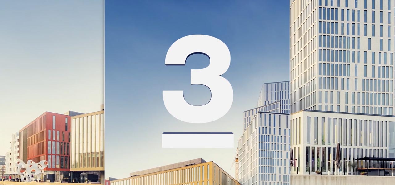
TV3 Sweden Rebrand
Turning the number three into an actual design system
A TV3 Sweden rebrand built around a simple strategic idea: use the channel's most recognisable asset, the number 3, as more than a logo. I worked across concept development, art direction and motion design to turn it into a flexible visual language that could stretch from entertainment and reality to sports and film without losing the brand.
Brief
TV3 Sweden wanted to broaden its appeal and move away from an identity that felt dated and too narrowly targeted. The new look needed to feel fresher, more neutral and more contemporary while still being clearly TV3.
It also had to accommodate a very mixed schedule. A system that works beautifully for lifestyle content but falls apart the moment football or a crime film appears is not much of a broadcast identity.
The Challenge
The key challenge was range. We needed one recognisable brand that could feel appropriate across genres with very different moods and audiences.
The solution had to be simple enough for everyday production, but not so generic that everything looked the same. It also needed to preserve existing brand recognition while creating enough visual change to feel like a genuine rebrand.
Execution
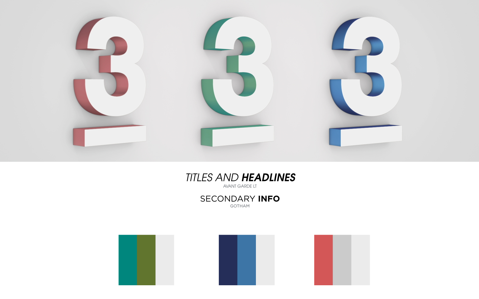
We developed the concept around 'The Power of Three'. The number 3 became a structural device, influencing composition, colour families, layout divisions and motion behaviour.
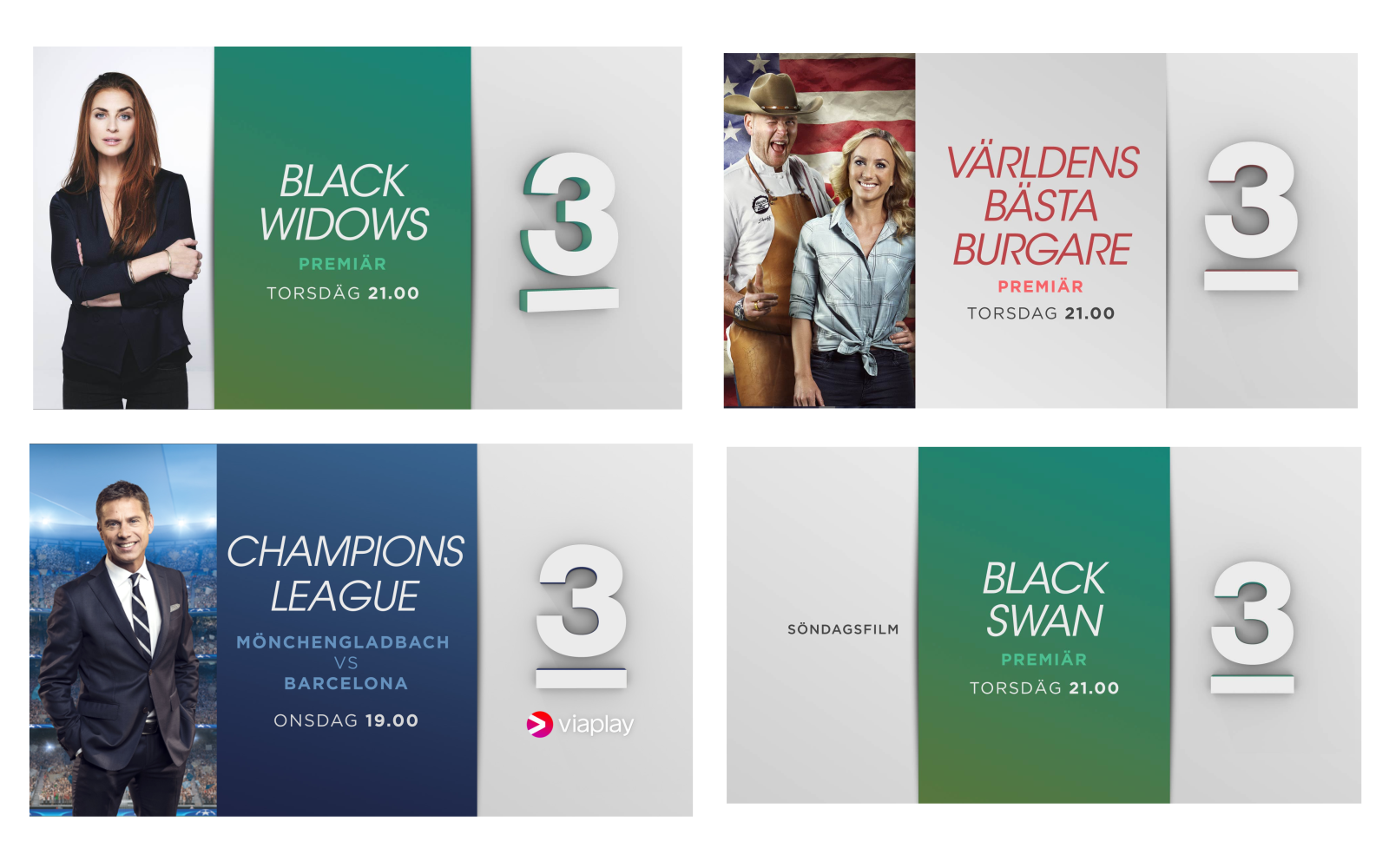
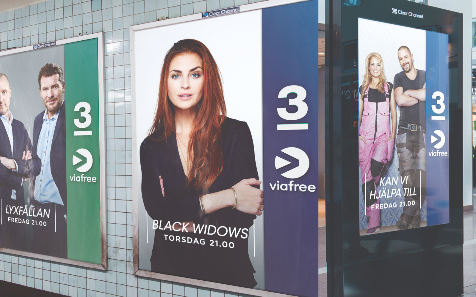
I contributed to the concept routes, visual development and on-air execution, helping translate the strategic idea into promos, menus, transitions and supporting graphics. Three colour families allowed the identity to shift tone depending on content, while recurring proportions and graphic structures kept everything recognisably TV3.
Rather than decorating every asset with the logo, the system let the brand shape how the content was organised.
Stills & Styleframes
Results
The rebrand gave TV3 a more open and versatile visual voice while keeping the channel recognisable. The system could move between genres without needing a separate identity for each one, which made it more useful in real broadcast production.
The strength of the final idea was its simplicity: one familiar brand asset doing much more work.
Personal Reflection
This project reinforced something I still believe: a strong system does not need dozens of clever ingredients. Sometimes one clear idea, pushed properly, is enough.
The number 3 stopped being the thing you put in the corner and became the logic behind the whole identity. That was the interesting part.